Sam Selikoff@samselikoff
An educator and consultant that focuses on modern UI development.
I’m an educator. Whether I’m consulting with a team, mentoring developers, or making videos that teach tools and techniques, my primary goal is to help people learn. I live for those arresting ah-ha moments that come from the perfect connection between teacher and student.
What led you into design and code?
I fell into programming at age 25 and started with perl scripting – about as far from design as you can get. As I moved up the stack from SQL to PHP to JavaScript, I quickly realized my passion lay in the space between the user and the interface. My mother and brother are both artists which helped me appreciate the beauty in life. I don’t consider myself a designer yet, but it’s something I aspire to.
The inflection point for my frontend coding becoming more design-focused was learning Tailwind CSS and meeting Adam Wathan and Steve Schoger. Their work began to train my eye on design fundamentals that I had missed by starting out in the backend world. Things like soft text and background colors instead of pure blacks and whites; typographic principles like the relationship between line height, letter spacing, and font size; and the effective use of white space significantly upped my design game while doing my own work.
What made you decide to start buildui.com?
I’ve run embermap.com since 2016 along with my business partner Ryan Toronto. It's another premium screencasting site focused on the JavaScript framework Ember.js. As our interests broadened it became clear to us that we wanted to reposition our professional offerings.
In 2020 I started a YouTube channel and was thrilled with the engagement from the wider JavaScript community. Both Ryan and I love teaching and we’ve always wanted to start a profitable business that could let us focus exclusively on it without the need for consulting. In October 2022 the time seemed right to launch buildui.com. Our first course offering teaches animation in React with the excellent Framer Motion library.
I’ve always been drawn to avenues of teaching that have the biggest impact. I’m quite optimistic that Build UI and YouTube will provide a sustainable way to get there.
What are some products that are a great example of delightful UI interactions?
It’s cliche but I’m a huge fan of Apple. The best interface is one that’s not there because the desired outcome has already been anticipated. A step away from that is user interfaces that do the same thing. The Apple Watch automatically tracking your laps and stroke style during a swim, or the iPhone’s autosuggestion for SMS two-factor codes come to mind.
Trello’s original drag-and-drop card interface was radical for the time, and executed with just the right amount playfulness (the cards tilted while being dragged). Their app still continues to add delightful touches to their UI, for example by showing a satisfying animation when completing the last item in a Checklist.
What pieces of work are you most proud of?
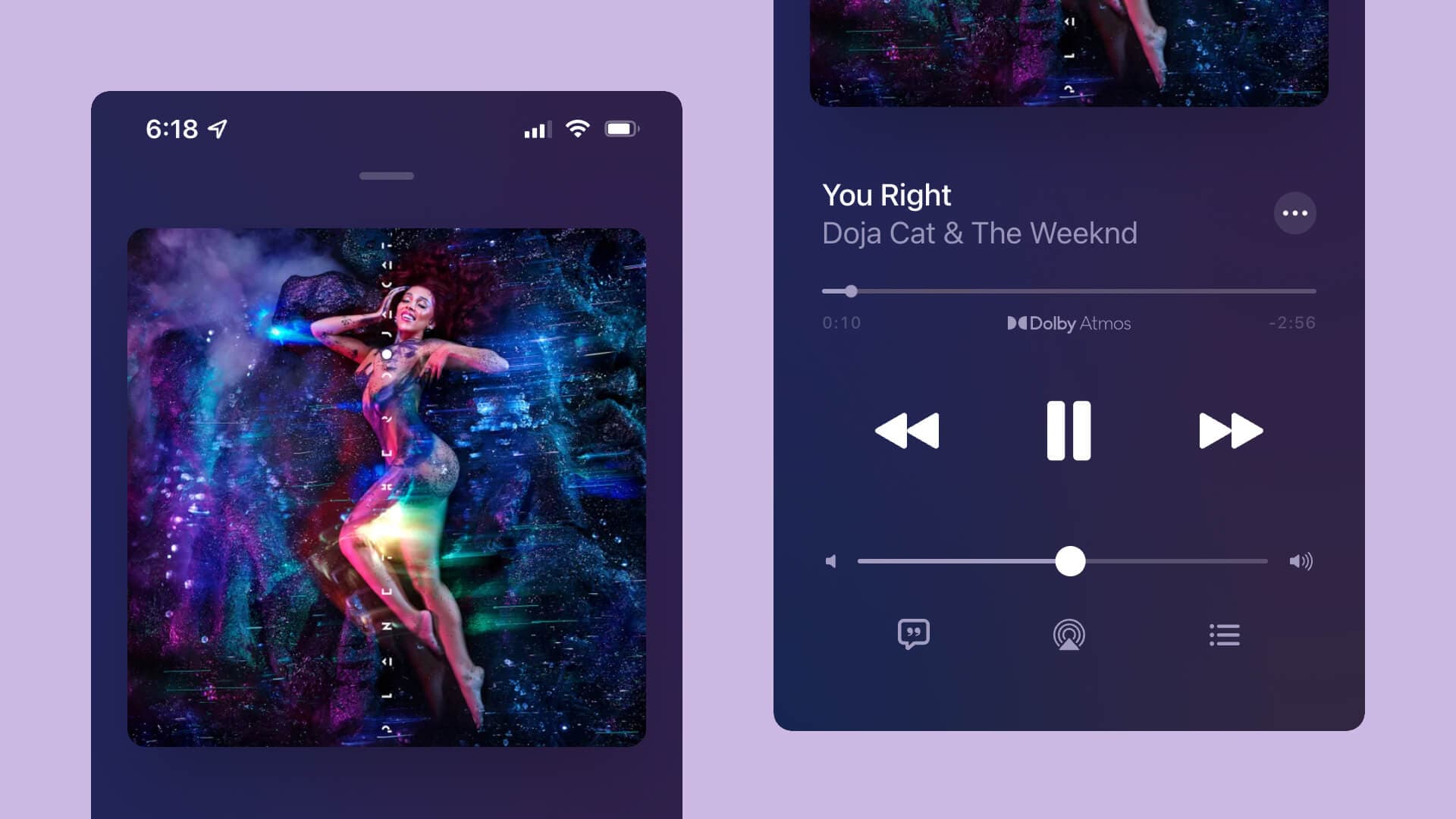
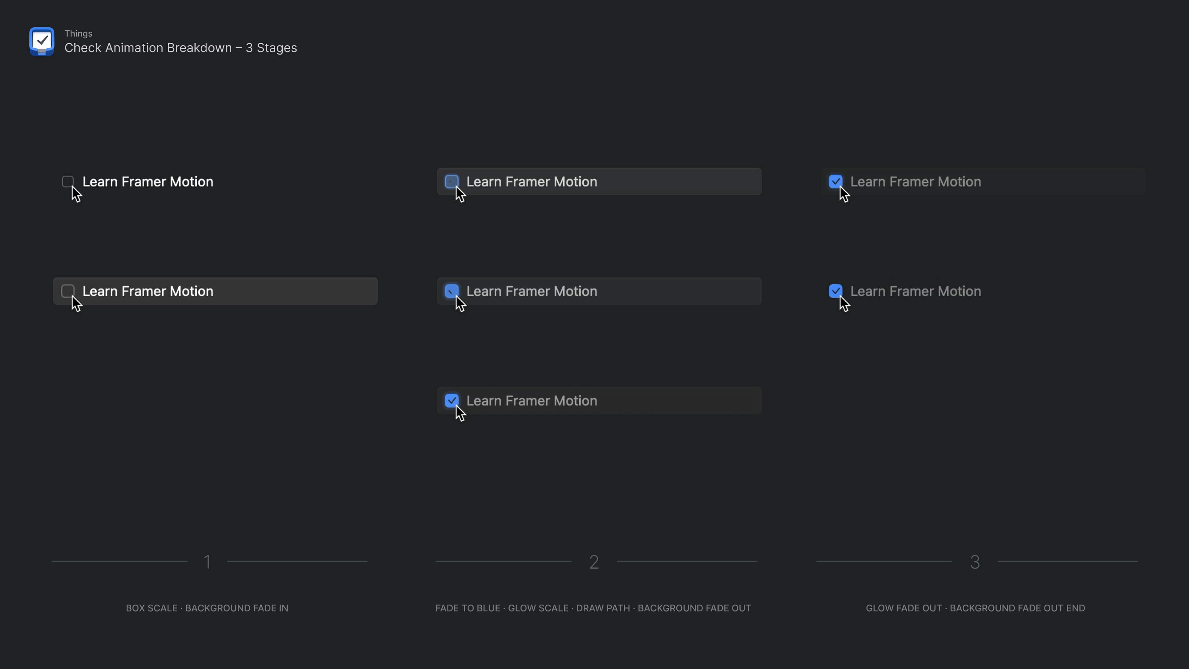
I love reverse-engineering existing apps and recently rebuilt the player from Apple Music. I also rebuilt the rewarding check animation from Things while learning Framer Motion. On projects like this I obsess over every detail – I even screen recorded the animations so I could match them frame by frame.


What is good design in your opinion?
Good design is design that helps a user achieve their outcome. An animation that motivates a user to complete their fitness goal is good design; an animation that slows down a user from reordering tasks is gratuitous.
The same is true for static design choices like color, typography and layout. It’s all about understanding the needs of the user.
Other creators and makers. I love seeing real works-in-progress on Twitter and YouTube.
How do you keep yourself motivated?
Taking space when my body tells me it’s time – I absolutely love what I do, so if I’m not enjoying it, something is off balance. Over the years I’ve also learned how to better structure my schedule in a way that balances deadlines with serendipity.
What are your design pet-peeves?
Custom select menus! Overused and poorly designed. Anyways, dropdowns should be the UI of last resort.
What are you currently excited about?
React Server Components. As a design-oriented programmer (rather than a designer who knows how to code), my first love will always be building out interfaces. I’ve taught everything from database modeling to how to build APIs, all in service of creating delightful user-focused frontends. Anything that makes it easier for developers to get to the frontend faster, with fewer errors and less friction, is exciting to me. Just like every major innovation that has come to React has unleashed a wave of innovation and higher-level components that the community has built upon, I think the same will be true of Server Components.
Do you have any advice for ambitious designers or engineers?
Follow your interests, build projects that are motivated by a real problem you or somebody else faces, and share your work.
How does your setup look like?
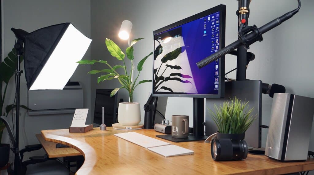
I work and shoot out of my apartment in New York City.


What are your favorite brands?
Apple, Teenage Engineering, Paige, Nintendo, West Elm, Ugmonk
Key Takeaways
The best interface is one that’s not there because the desired outcome has already been anticipated.
Build projects that are motivated by a real problem you or somebody else faces, and share your work